Mapping Urban Inequality in Nairobi: From Citywide Access Gaps to Service Pressure in Kibera, the biggest slum in Africa
Rapid urbanisation in cities like Nairobi has intensified pressure on essential services, particularly in health and WASH (water, sanitation, and hygiene). While aggregate statistics often suggest improvements in access, they can obscure sharp spatial inequalities within cities.
1. Introduction
Rapid urbanisation in cities like Nairobi has intensified pressure on essential services, particularly in health and WASH (water, sanitation, and hygiene). While aggregate statistics often suggest improvements in access, they can obscure sharp spatial inequalities within cities.
This project uses geospatial analysis to explore a central question:
Where are the largest mismatches between population concentration and access to basic services in Nairobi?
By combining gridded population data with mapped service locations, the analysis identifies areas where high population exposure coincides with limited access, highlighting potential priority zones for intervention.
The results point to a fragmented geography of inequality across Nairobi. Rather than being concentrated in a single core area, priority zones form a dispersed belt across rapidly growing peripheral areas, suggesting that urban expansion may be outpacing the provision of basic services.
At the same time, a closer look at Kibera — often described as one of the largest informal settlements in Africa — tells a more nuanced story. While services such as water points and health facilities are relatively widespread, this does not necessarily translate into equitable access.
In particular, sanitation infrastructure appears under greater pressure: even where toilets are present, they often serve large numbers of residents, pointing to issues of overcrowding, quality, and affordability. Proximity alone, in this context, does not fully capture the lived reality of access.
Taken together, these findings suggest that urban inequality is less about the absolute absence of services than about their uneven distribution and capacity relative to population density, raising important questions for how cities identify and prioritise intervention areas.
2. Data & Methods
Data sources
Population: WorldPop (2026), gridded population data (100 m resolution)
Health facilities and WASH points: OpenStreetMap (OSM); Map Kibera Project
Kibera boundary: Author-defined based on UN-Habitat reports and academic literature
Satellite imagery for Kibera comparison: Google Earth Engine Sentinel-2 annual composites (2018, 2020, 2022, 2024)
Base map: OpenStreetMap (OSM)
Methods
All spatial analysis was conducted in QGIS
Population aggregated from WorldPop gridded data (2026, 100 m resolution)
Distance to nearest facility calculated using Euclidean (straight-line) distance as an approximation of accessibility
Kernel density estimation used to identify local clustering patterns (Kibera)
Composite priority index constructed combining population exposure and service accessibility deficits (distance to health and WASH services). To support decision-making, the analysis supposes that if resources are limited, the model highlights the top 20% of areas where interventions may have the greatest impact.
To provide spatial context for the Kibera case study, annual Sentinel-2 composites from 2018 to 2024 were visually compared within a fixed reference boundary. This comparison was used to identify interpreted zones of apparent expansion, relatively stable built-up core, and uncertain transition, rather than to delineate exact annual settlement boundaries.
3. City-level patterns in Nairobi
3.1 Population Distribution Across Nairobi
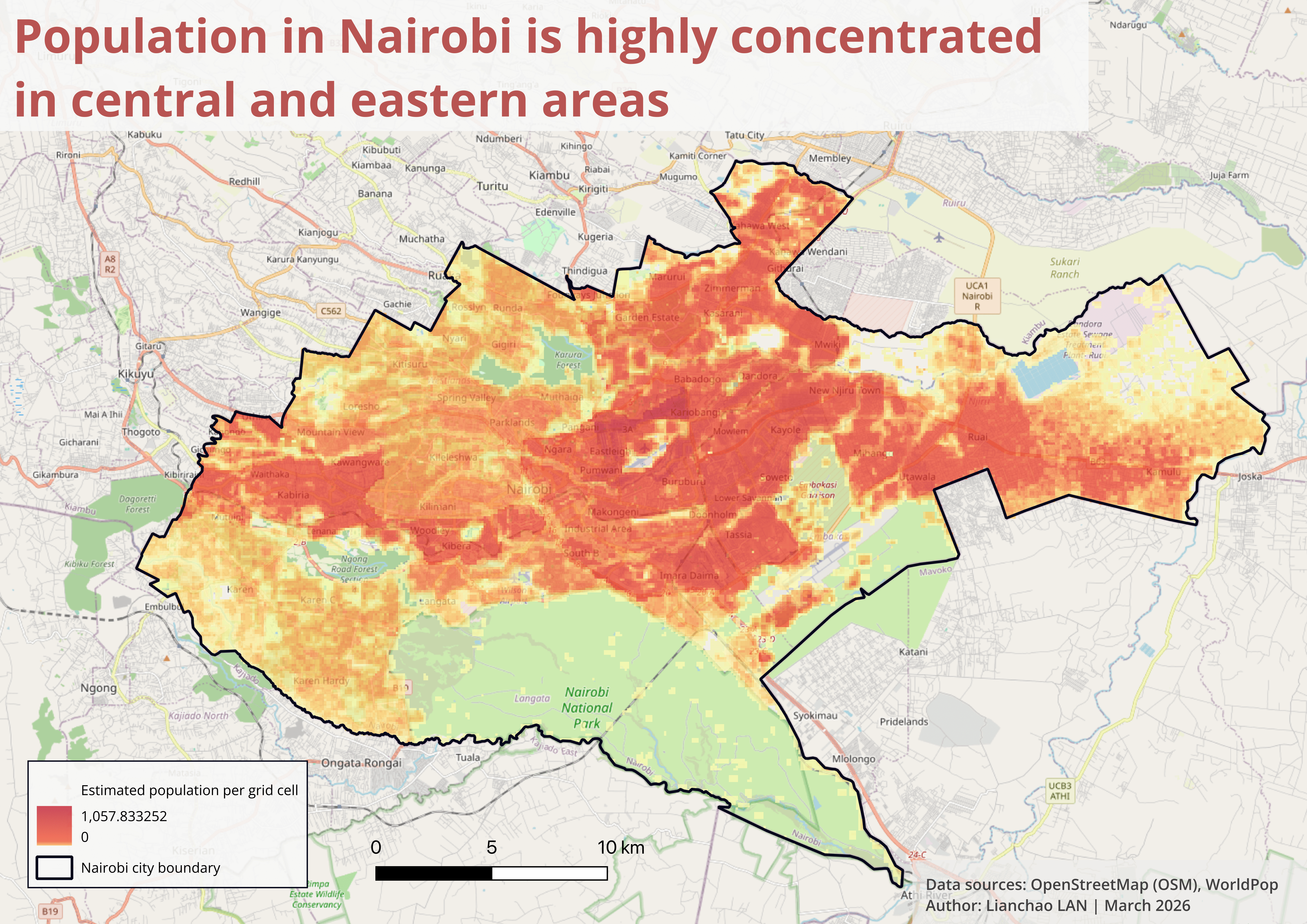
Nairobi’s population distribution is highly uneven, with dense clusters concentrated in the central and eastern parts of the city. Understanding where people live is essential before identifying areas where health and WASH services may be insufficient.
3.2 Health Service Accessibility Across Nairobi
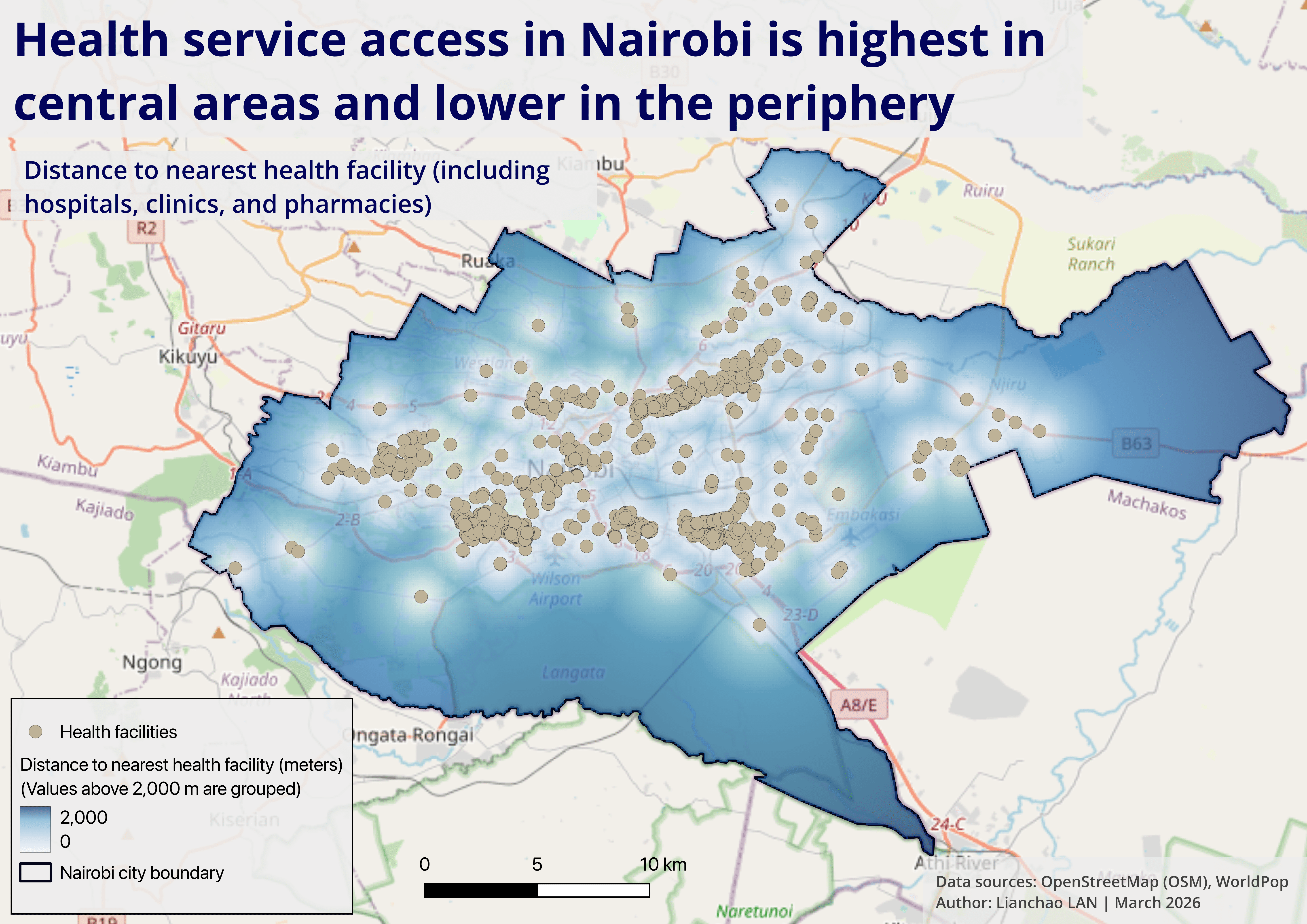
Health facilities in Nairobi are strongly concentrated in the central urban corridor. Peripheral neighborhoods, particularly in the south and eastern outskirts, exhibit significantly lower accessibility.
3.3 WASH Service Accessibility Across Nairobi
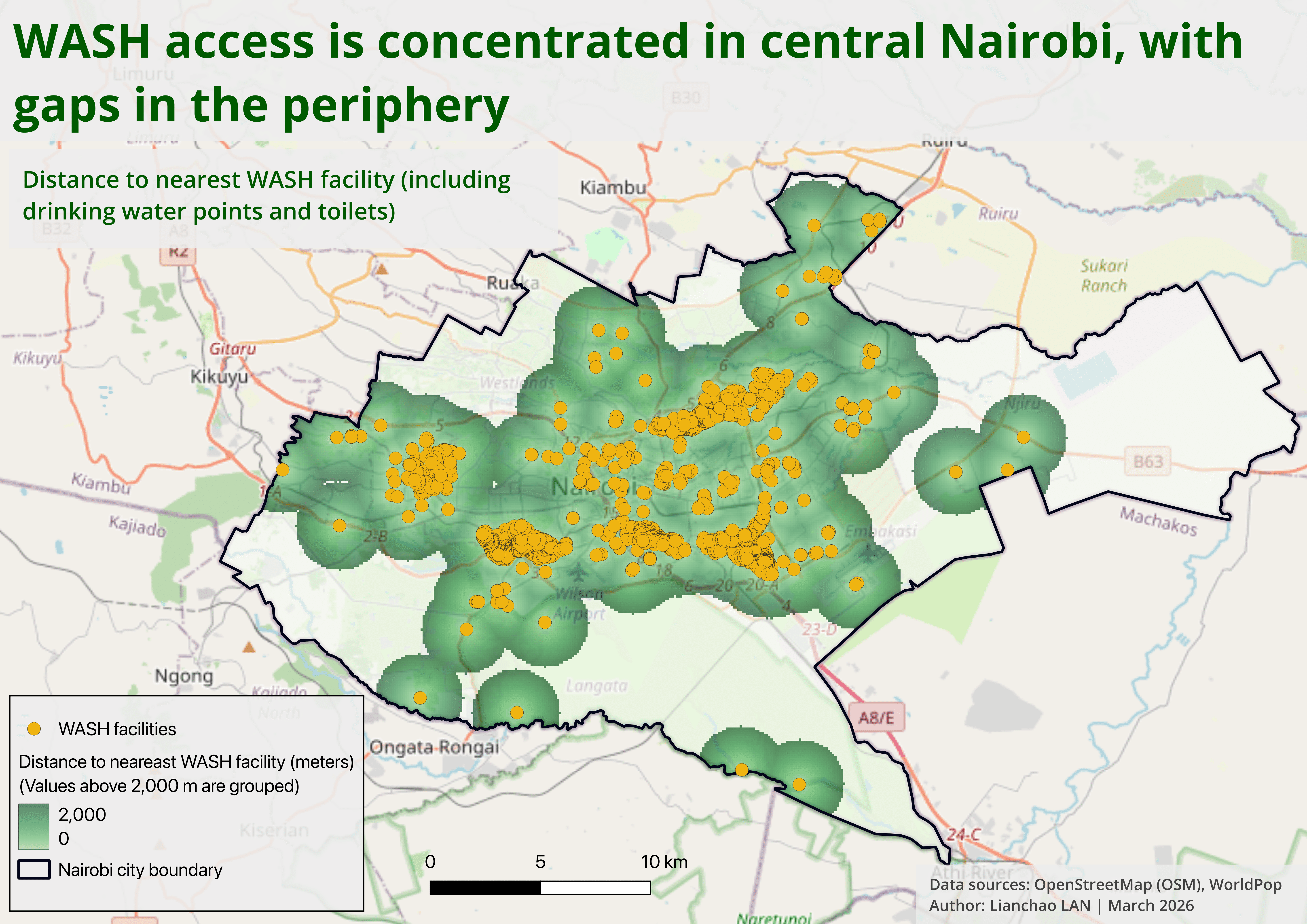
Similarly, WASH facilities in Nairobi are primarily concentrated in the central urban corridor, while peripheral neighborhoods, particularly in the south and east, experience significantly lower accessibility.
3.4 Priority area in Nairobi
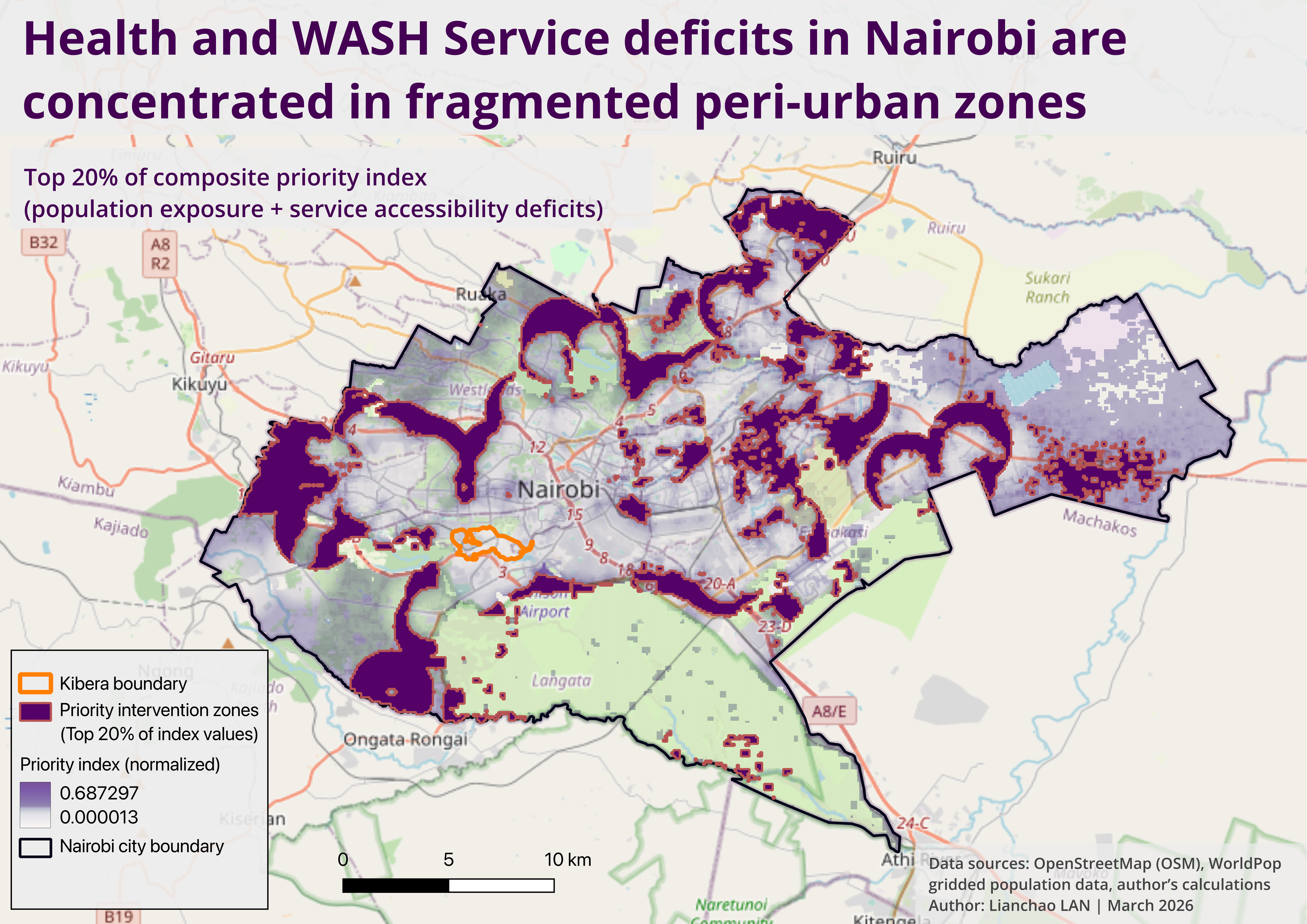
1) Constructing the Priority Index
To identify areas where interventions would have the greatest impact, I constructed a composite priority index combining population exposure and service accessibility deficits.
The index is defined as:
Priority Index = (0.4 × Population) + (0.3 × Health Access Deficit) + (0.3 × WASH Access Deficit)
Why this structure?
Population (40%)
Captures where demand is highestHealth deficit (30%)
Captures lack of access to essential health servicesWASH deficit (30%)
Captures lack of access to water and sanitation
👉 This weighting reflects a simple principle:
Areas with both high population density and poor service access should be prioritised.
2) Measuring accessibility deficits
Accessibility is measured using distance to the nearest facility.
However, raw distance is not directly comparable, so I applied two key transformations:
1) Distances were capped at 2 km, based on a reasonable upper bound for walking access to essential services in urban environments.
Beyond this threshold, differences in distance become less meaningful in practice — whether a facility is 3 km or 5 km away, access is already severely constrained.
👉 In practice:
Distance ≤ 2,000 m → meaningful variation
Distance > 2,000 m → treated as equally high deficit
2) Normalisation (0-1 scale)
All variables were normalised to ensure comparability.
A. Health / WASH deficit
Deficit = min(distance,2000) / 2000
0 → facility very close
1 → very far (≥ 2 km)
B. Population
Population was normalised relative to the maximum observed value:
Population(norm) = population / max(population)
👉 This ensures that:
High-density areas receive higher priority weights
Sparse areas are downweighted
3) Selecting priority intervention zones
To simulate real-world resource constraints, I applied a targeting scenario:
Assume only 20% of areas can be prioritised for intervention.
Method:
The priority index was ranked across all grid cells
The top 20% highest values were extracted
Values were classified using quantile-based thresholds
4) What this approach captures (and what it doesn’t)
Captures
Spatial mismatch between population and services
Relative priority across the city
Fragmented patterns of inequality
Limitations
Uses straight-line distance (not travel time or road networks)
Does not account for facility capacity
Relies on available OSM data, which may be incomplete
The priority index does not simply map where services are lacking, but where the lack of services affects the largest number of people.
3.5 Main findings from the city-level analysis in Nairobi:
1) Peri-urban areas, not the city centre, emerge as priority zones
The highest priority areas do not cluster in Nairobi’s central districts. Instead, they form a fragmented belt across the urban periphery.
This pattern suggests that service deficits are driven less by inner-city deprivation and more by rapid peri-urban expansion, where infrastructure development has not kept pace with population growth.
2) Kibera does not appear as a top-priority zone
Interestingly, Kibera — often cited as Nairobi’s most prominent informal settlement — does not emerge as a top-priority zone in this analysis.
This may reflect the relatively high density of mapped health and WASH facilities in the area, potentially linked to sustained NGO and donor interventions over time.
However, this should not be interpreted as an absence of need, but rather as a difference in the type of service constraints (e.g. capacity rather than coverage).
3) The model captures exposure, not poverty
The model highlights areas where large populations face significant distance to basic services, rather than identifying poverty directly. In this sense, it captures spatial exposure to service deficits, not socioeconomic vulnerability per se.
4) Inequality is fragmented, not uniform
Priority zones appear spatially fragmented and discontinuous, rather than forming a single large underserved district. This suggests that urban inequality is shaped by uneven infrastructure coverage at a local scale, rather than a simple core-periphery divide.
Together, these findings suggest that urban inequality in Nairobi is not only about where services are located, but how well they match patterns of population growth and demand.
4. Zoom-in: Kibera
To better understand how these dynamics operate at the local level, the analysis zooms into Kibera, one of Nairobi’s largest informal settlements. I want to answer questions such as how evenly distributed are health and WASH services within Kibera? Where are the major service gaps?
4.1 Kibera health facilities distribution
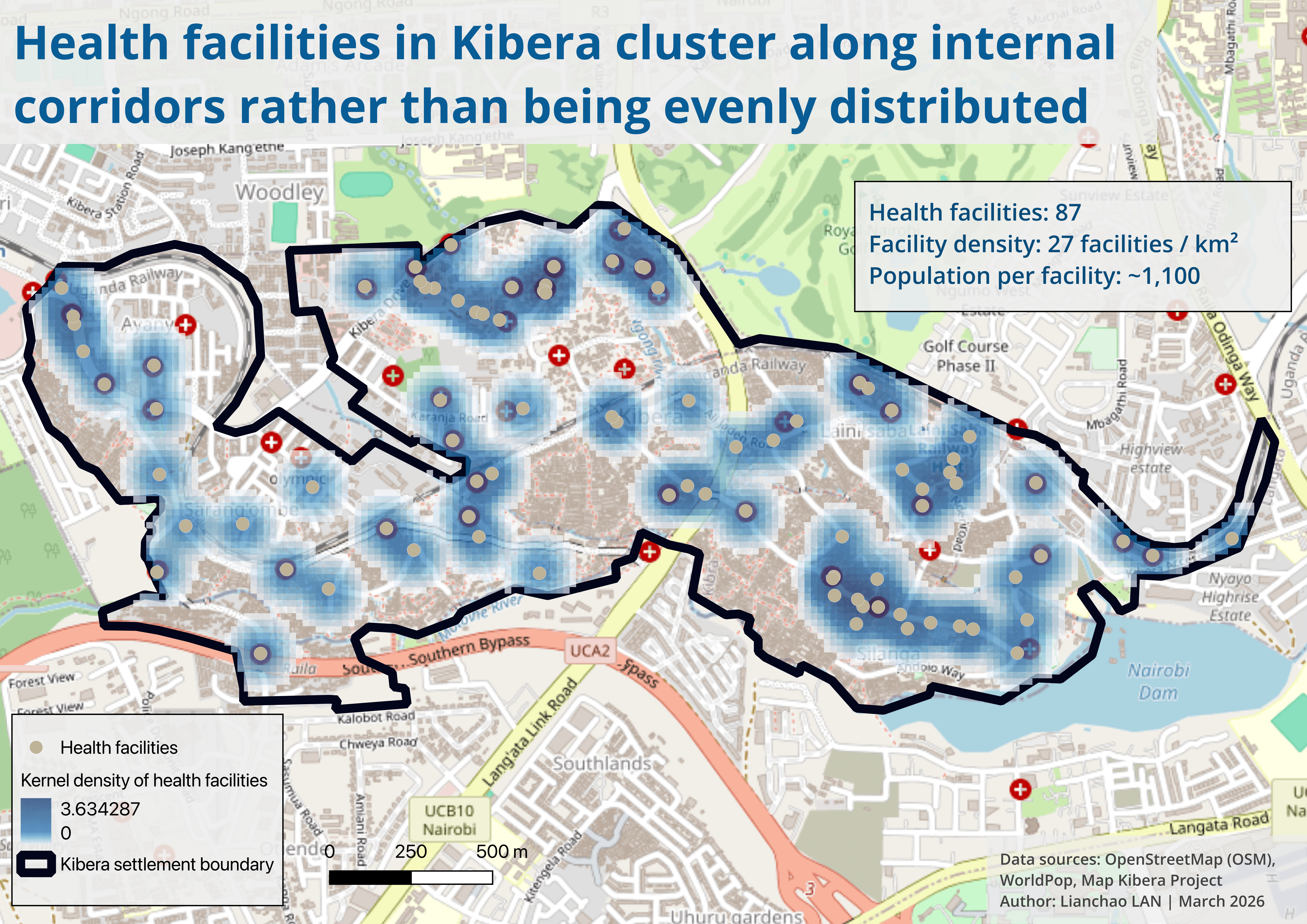
1) Health service access in Kibera
To better understand local service dynamics, I conducted a detailed analysis of health facility distribution within Kibera.
Kibera has an estimated population of approximately 95,000 residents, with 87 mapped health facilities across an area of about 3.24 km².
Note: Population estimates vary significantly across sources. While a UN-Habitat report suggests around 250,000 residents in Kibera, this analysis uses gridded population data (~95,000) for consistency across spatial calculations. This discrepancy likely reflects differences in spatial delineation of Kibera, the resolution and modelling assumptions of gridded datasets, and the challenges of accurately measuring population in informal settlements.
This translates into a relatively high overall facility density. However, spatial distribution tells a more nuanced story:
Health facilities are not evenly distributed, but cluster along internal corridors, likely reflecting patterns of mobility, economic activity, and informal infrastructure.
As a result, access varies significantly within the settlement despite the overall density.
2) Proximity analysis (200m walking-distance proxy)
To assess local accessibility, I calculated the share of the population located within a 200-meter buffer of a health facility — used here as a proxy for short walking distance.
Approximately 91.5% of the population falls within this range
Around 8.5% remains outside
This partially helps explain why Kibera does not emerge as a top-priority zone in the city-level analysis: coverage appears relatively high, even though access constraints may persist in other forms.
4.2 Kibera water point distribution
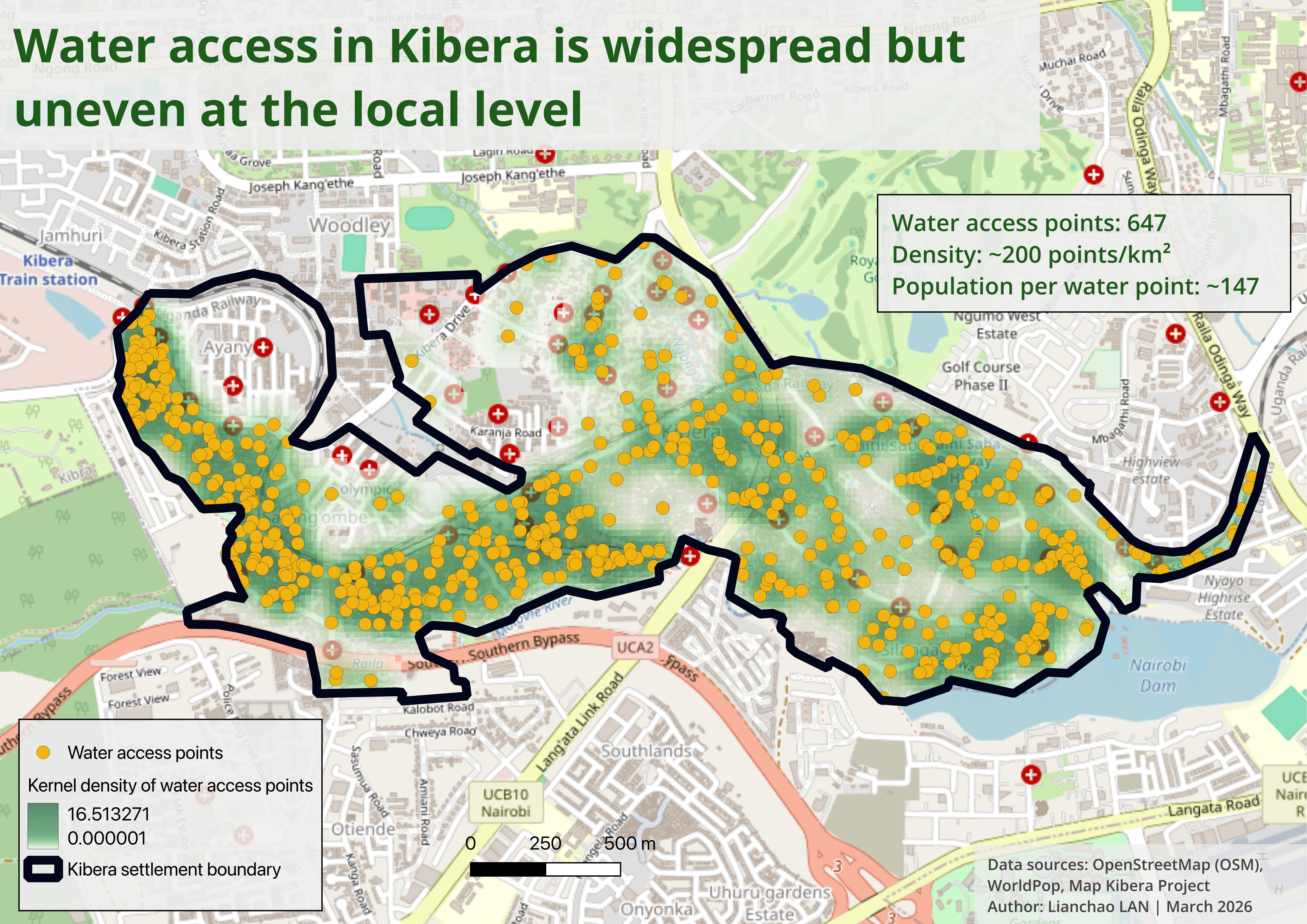
1) Water access in Kibera
To complement the analysis of health services, I examined the distribution of water points across Kibera.
Kibera has approximately 95,000 residents and over 600 mapped water points within an area of about 3.24 km², indicating a relatively high density of water infrastructure.
Spatially, water points are widely distributed across the settlement, with higher concentrations in the central and western areas.
2) Proximity analysis (100m walking-distance proxy)
To assess accessibility, I calculated the share of the population located within a 100-meter buffer of a water point — used here as a proxy for very short walking distance.
Approximately 87% of residents live within this range
A remaining share — roughly 10-15% of the population (roughly 10,000-12,000 residents) — falls outside this threshold
4.3 Kibera sanitation distribution
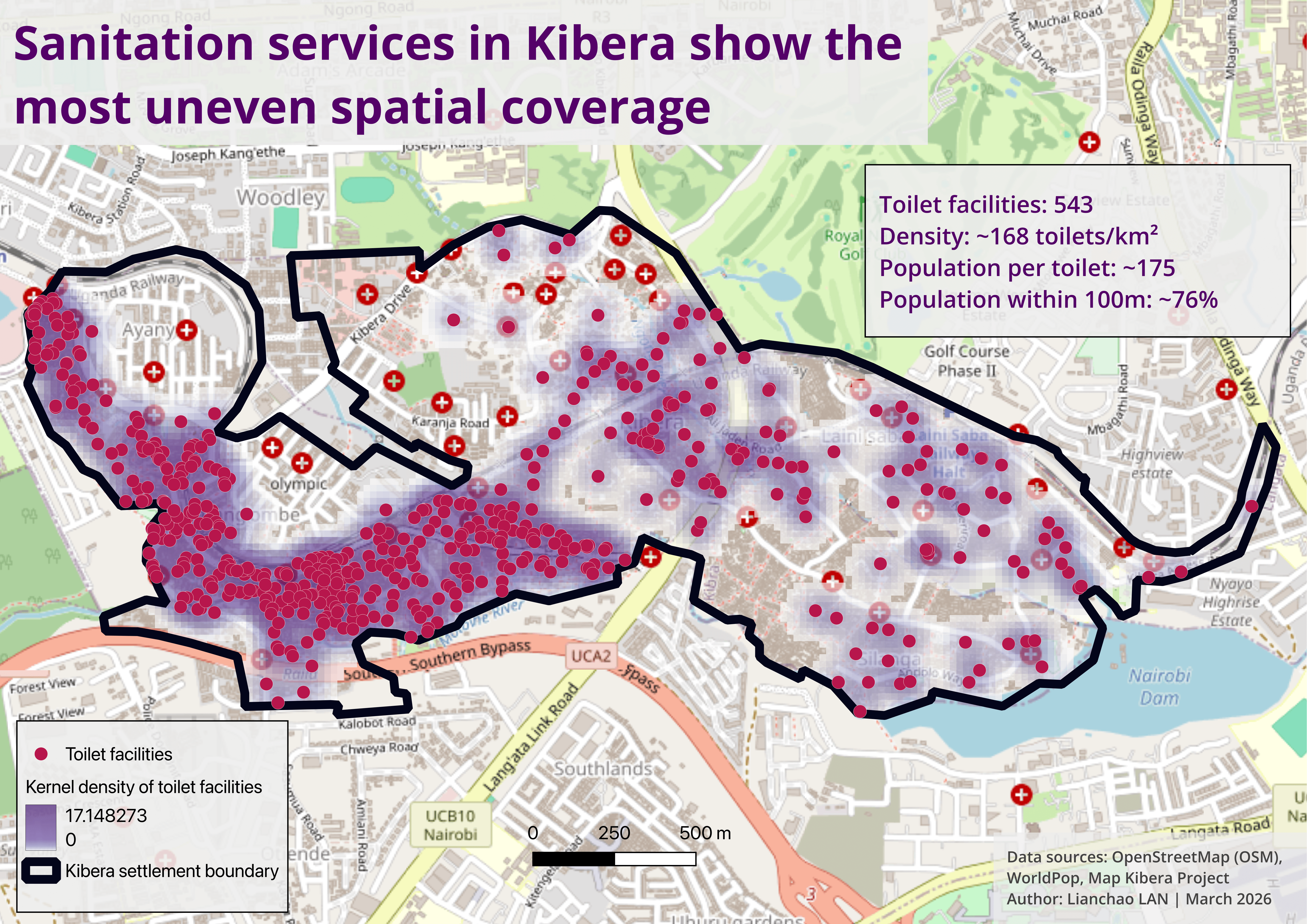
1) Sanitation access in Kibera
To assess sanitation access, I analysed the distribution of toilet facilities across Kibera.
Compared to water points and health facilities, sanitation infrastructure shows a more uneven and fragmented spatial pattern, with facilities concentrated in specific areas and noticeable gaps elsewhere.
2) Proximity analysis (100m walking-distance proxy)
Using a 100-meter buffer as a proxy for short-distance access:
Approximately 76% of residents live within this range
Around one quarter of the population remains outside
The Kibera dive-in analysis reveals that service distribution varies significantly across infrastructure sectors. While water points are more widely distributed across the settlement, health facilities are fewer and provide more limited spatial coverage. Sanitation infrastructure shows the most uneven spatial coverage and sanitation access may still be constrained by quality, affordability, and overcrowding of shared facilities.
4.4 Kibera sanitation pressure map
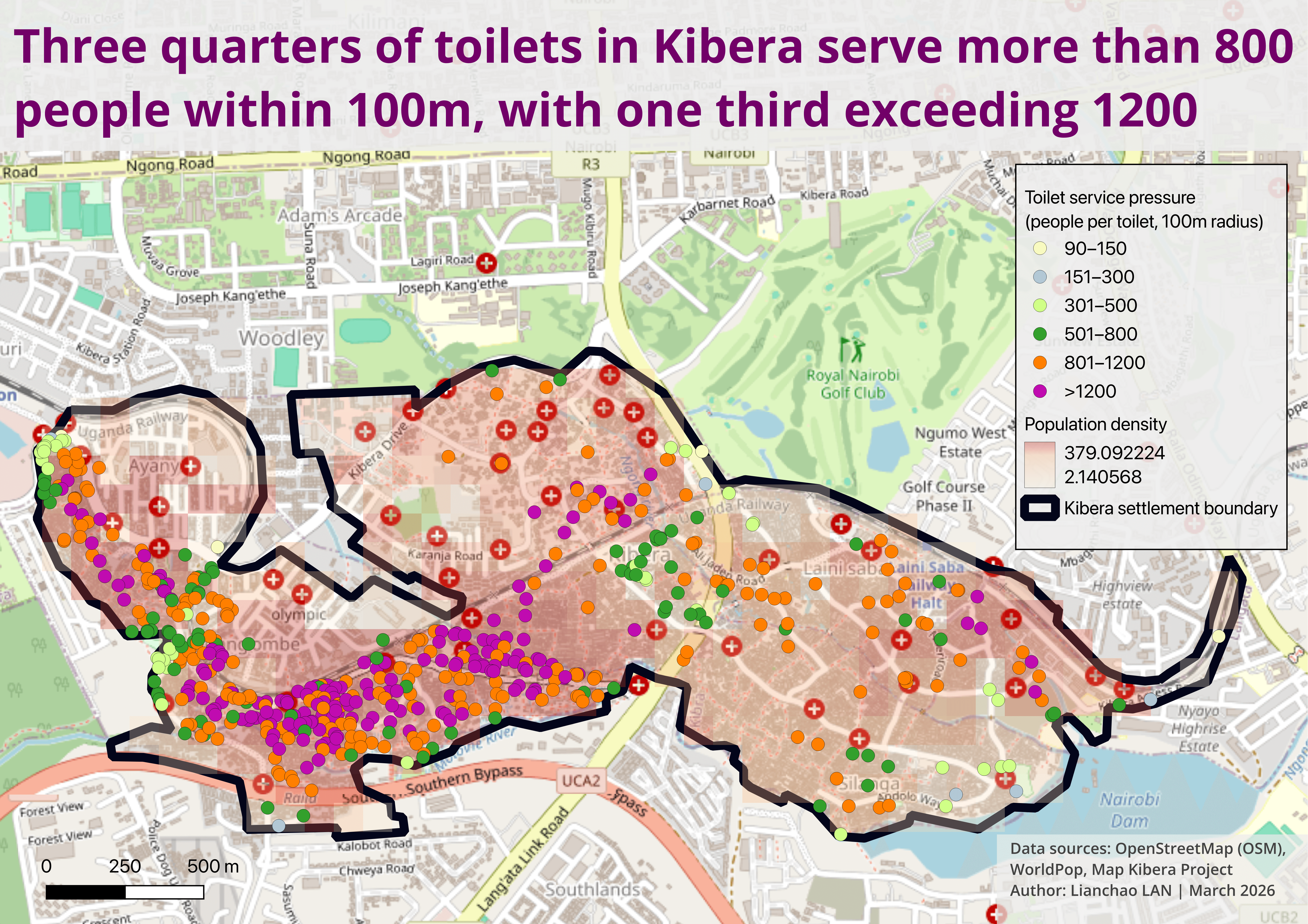
1) Toilet service pressure in Kibera
This map estimates the number of people sharing each toilet within a 100-meter radius, providing a proxy for local sanitation pressure.
The results reveal strong spatial inequalities:
High-pressure clusters are concentrated in the central and southern parts of Kibera, where population density is highest
Lower-pressure areas are more scattered and limited, indicating an uneven match between infrastructure and demand
2)Key insights
While average figures may suggest moderate service levels, the spatial distribution shows that:
Many toilets serve very large local populations
Pressure is highly concentrated in specific zones
Values represent potential service pressure based on proximity and do not reflect actual usage patterns. Because service areas overlap, the same population may be counted multiple times. As a result, average figures can underestimate inequality: while overall pressure appears moderate, spatial clustering reveals much higher localised demand in specific areas.
4.5 How Kibera’s landscape changed over time
To better understand service pressure in Kibera, I looked further at how the settlement’s built-up landscape evolved between 2018 and 2024. Rather than estimating exact yearly boundaries, I used a fixed reference boundary manually derived from a 2021 UN report and compared annual satellite composites within the same spatial frame.
The imagery suggests that the overall footprint remains broadly stable, but some edge areas show visible change, including apparent expansion in the southwest and smaller shifts along transitional zones. This matters because even modest outward growth can increase pressure on already limited health and WASH services, especially where facilities cluster unevenly.


This map translates the visual comparison into a simple interpretive framework. The central core appears persistently dense across all four years, suggesting that service pressure in Kibera is likely shaped less by large-scale internal redistribution than by already high and enduring concentration. By contrast, the southwest shows the clearest signs of outward expansion, while several edge areas remain transitional and harder to classify with confidence. This interpretation helps situate findings on uneven facility distribution: service gaps are not only a matter of where facilities exist today, but also of how settlement growth and edge dynamics may outpace infrastructure provision.
5. Conclusion: Beyond Access — Understanding Urban Service Inequality
This analysis shows that urban inequality in Nairobi cannot be understood through simple measures of service presence or coverage alone.
At the city level, the results highlight that the most critical service gaps are not located in the urban core, but in rapidly expanding peri-urban areas, where infrastructure development has not kept pace with population growth. Rather than forming a single underserved zone, inequality appears fragmented and spatially discontinuous, reflecting uneven patterns of urban expansion.
The case of Kibera further illustrates the limits of conventional access metrics.
Despite relatively high apparent coverage — particularly for health and water services — important disparities emerge at the local scale:
Water points are widely distributed but still leave small pockets underserved
Health facilities are fewer in number and unevenly distributed
Sanitation infrastructure shows the most uneven coverage
Most importantly, the sanitation pressure analysis reveals that:
access does not equal adequacy
Even where facilities are geographically nearby, high population density and overlapping service areas create significant localised pressure, meaning that infrastructure may be present but insufficient in practice.
🔍 Key takeaway
Urban service inequality is not only about distance, but about the relationship between population, distribution, and capacity.
By combining city-scale analysis with local-level investigation, this project demonstrates how geospatial methods can help bridge the gap between data, spatial patterns, and decision-making, offering a more nuanced understanding of urban inequality in rapidly growing cities.